


We take a look at what brand colour psychology marketing is, colour trends, the importance and the misconceptions surrounding it.
Colour is a core part of humans’ evolutionary development and can be an incredibly powerful marketing tool.
Not only can humans detect more than 100 million colours,1 but they can detect colours and images in as little as 13 milliseconds.2
This speed of colour recognition continues to play a critical role in modern human life, with consumers making 62-90% of all snap decisions around products based purely on colour.3 For marketers, that automatically makes colour a valuable tool to influence consumer behaviour.
The food and beverages industry is an excellent example of colour psychology. Coke is always readily associated with red, while blue reminds consumers of Pepsi. Meanwhile, BP attempted to rebrand in 2020 by switching to green and yellow to reflect its commitment to the environment.4
Many companies across industries use contrasting colours to great effect. Snapchat, Stanley Tools, and Best Buy all have a black-and-yellow colour combination.5 The black symbolises authority, power, elegance, and mystery, while yellow brings energy, excitement, and optimism.
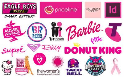
Having instantly recognizable colours can be critical in business.
And it’s not just brands and products, even individual fashion trends are being influenced by colour psychology. Thanks to a recent viral TikTok trend, people are flocking to Korean colour consultants in Seoul to discover their “personal colours”.6
To better understand the impacts of colour, it's best to explore what brand colour psychology marketing is, colour trends, and how advertisers and agencies can tap into the power of colour psychology.
Table of contents:
- What Is Colour Psychology?
- Why Is Colour Psychology Important in Marketing?
- How Do Brands Use Color Psychology?
- List of Colour Meanings
- How to Use Color Psychology in Marketing
- Final Thoughts
- Become an Advertiser with Commission Factory
- Colour Psychology in Marketing - FAQs
- References
What Is Colour Psychology?
Colour psychology is the study of colours and their impact on human behaviour. The theory behind colour psychology is that by using specific colours, advertisers and agencies can influence or persuade their target audience to feel a certain way about their brand or product.
These feelings may inspire their customer to take action such as clicking the sign-up button, subscribing to a newsletter, or purchasing a product.
Does the colour of a pair of shoes compel us to buy? Do website button colours affect our behaviour and make us more likely to click through on one more than the other?
The simple answer is: yes.
Isaac Newton first observed sunlight passing through a glass prism back in the 17th century. He saw how the light was reflected into various colours and identified six wavelength shades: red, orange, yellow, green, blue and violet, later adding indigo.7
But colour psychology predates Newton's discovery by thousands of years, with the Ancient Egyptians studying the effect of different colours on mood (PDF download).8 Colours in Ancient Egypt were steeped in symbolism, often representing a person's stature or even the nature of things.
The theory behind colour psychology is complex. Academics have dedicated themselves to the different colours’ meaning and how they impact individuals based on demographic and social factors, including gender, location, education, and more.
Why Is Colour Psychology Important in Marketing?
Colour psychology is important to marketers because colours can trigger strong reactions in people. They have the power to attract and repel, communicate emotions and perceptions, and influence or suggest certain actions and behaviours, all without using a single word.
And since marketing is all about communicating, conveying ideas, and influencing consumer behaviour, colour is a critical component for all advertisers.
When marketers understand colour psychology, they can use that to understand customer psychology. By understanding customer psychology, they can better predict how their target market will respond to marketing messages to provoke an emotional response, action, and boost their conversion rate.
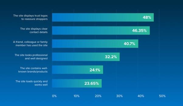
Colours Can Help Build a Strong and Trustworthy Brand
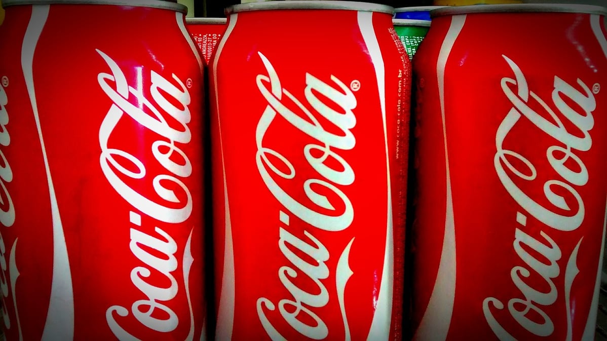
Colour is a powerful tool in branding. Consumers can quickly identify brands by their logos, because of distinctive colours and colour schemes. Take a look at the highly recognisable bold red used by Coca-Cola:
Background colours can stir emotions deeply.9 These emotions play a role in how people behave and their connections with an advertiser right from the very start.
Most humans form an opinion about a brand within 90 seconds. Within that time, between 62% and 90% of decisions are influenced by colour alone.3 In other words, if an advertiser chooses the wrong colour, they’ll lose the chance to make an excellent first impression.
Colours Can Incite Action and Improve Conversions
Human behaviour is programmed to respond to colour. Drivers stop at red lights and go when they switch to green. By thoughtfully choosing colours, advertisers can attract customers and inspire them to purchase a product or service.
Many advertisers perform A/B testing, which has shown that the colour of a button on a website can increase conversions. Multiple case studies found that red button colours outperformed green buttons by 5-34%.10
Keep in mind, changing the colour of call-to-action (CTA) buttons doesn’t mean the conversion rate will accelerate, but it does mean that colour should inform a website’s design decisions.
Colour Schemes Can Influence Attitudes
By strategically leveraging colours for marketing and advertising, advertisers can portray their brand the way they want their audience to perceive the product message and values.
For example, McDonald's European division moved away from using its iconic red and gold in its branding in favour of a colour scheme that includes green.11 Why? To promote its message that it's more environmentally conscious.
This is why the psychology of colour can be so powerful for marketing efforts, it can help advertisers portray their brand to consumers the way they want.
Colour Palettes Can Help Differentiate Brands
Choosing the right colour combination for marketing and advertising can help brands stand out from one another. If other brands in the same industry are using similar colour schemes, then it's best to try and stand out with something different.
For example, ING Direct updated their colour scheme to orange after most banks were using blue.

Choosing the Wrong Colours Can Damage a Brand
If an advertiser chooses the wrong colour scheme, it can damage their brand image. For example, if a brand chooses the wrong colours for their website or font, it can impact the user experience (UX) by making it hard to read or understand. Choosing colours that are similar to their competitors risks being ignored altogether.
It's important to remember that not every consumer reacts to colour the same way. Every individual experiences colours differently based on culture, location, memories and sometimes gender.
Consumers will not all react the same way to colours. As individuals, we all have different experiences with colours based on significant events in our past, our culture, location, and memories. Differences may also depend on gender, a topic that has attracted considerable attention since the 1800s.12
Modern studies among children and adults across the UK, China, and Saudi Arabia show males have a greater preference for blue-green colours, while females prefer warmer colours in the red-pink/purple spectrum.
However, a lot of that may be down to how societal norms shape gender roles and assign separate colours to men and women. From a brand perspective, it’s more important to look at how certain colours are viewed differently across various cultures and regions.
In many countries, white is a symbol of peace, purity and virtue. However, in China, it is deeply associated with sadness and mourning. Some shades are linked to religion or sacred rituals.13 Saffron in India and green in Islamic societies are examples of colours that brands should use with caution.
Amidst all these differences, there are a few generalities about how people respond to colour and that’s what we’ll look at next.
How Do Brands Use Color Psychology?
Branding in the modern era relies heavily on colour psychology. Creating a colour palette is one of the first steps in branding. This matters a great deal since colours can increase brand recognition by as much as 80%.14
Prior to the digital revolution, storefronts, print media, billboards, and product packaging were the only places to display brand logos and colours. These days, brand colours are also used extensively across websites, digital ads, and social media.
Brands use colour theory and colour psychology to identify the colours that best represent their values and specific roles. There are some common colour preferences across various industries - food companies use warm colours because they draw attention and stimulate appetite.15
Blue, once voted the world’s favourite colour, is also a popular choice for the health and wellness industry.16 Shades of blue have a soothing effect on people and project a sense of cleanliness and trustworthiness. High-tech firms also heavily use it.
Bold colours such as black, pink, and red are common among fashion labels and beauty brands because they represent glamour, sophistication, and confidence, among other desirable qualities. In recent years, a combination of green and earthy tones has become popular among brands looking to market an eco-friendly image.17
Even within a brand, companies often use colour psychology to grade different tiers of products and create a sense of exclusivity. The use of purple, black, and gold shades on the packaging of pricier goods is a common sight. For instance, black credit cards are exclusively for ultra-wealthy clients.18
An important aspect of brand colour usage is continuity. Unless absolutely essential, most brands try to retain their brand colours for as long as possible. Coca-Cola has not used any other brand colour except red throughout its history.
Pepsi originally used red and white for its logo, before starting to use blue in its brand palette in the 1950s to better differentiate its logo and identity from its more popular rival.19 Over the decades, blue has come to dominate Pepsi’s brand identity, as a bold counterweight to Coke’s red.
With the rise of HD and 4K screens that are capable of displaying millions of hues, the importance of colour psychology has risen to new heights in marketing. Screens are everywhere and more and more customers rely on mobile devices for purchasing products.
Apart from product packaging and logos, colours also play a vital role in website design. Using a popular shade such as red for a CTA button can increase conversion rates by 21% or more.20 Studies have found that impulse eCommerce purchases account for nearly 40% of all money spent. 21
Digital marketers rely on these stats while crafting online flash sales and other promo content.
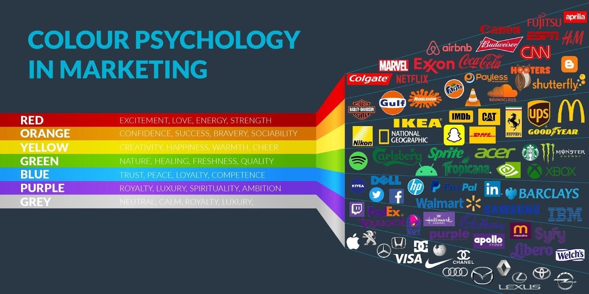
List of Colour Meanings
There are two main groups of colours, primary and secondary. Primary colours are red, blue, and yellow that can combine to create secondary colours orange, purple, and green. There is a third group of other colours that are also worth exploring.
Each colour in the above groups has its own psychology and meaning.
Primary Colours
Red Colour Psychology
The colour red is a dynamic, bold colour associated with excitement, passion, danger, and action. It reflects the physical need to show love and affection and to portray fear. Depending on its use, red is also an energising colour that can represent either strength or aggression.
Because of its powerful presence it's great for call-to-action buttons, sale announcements and getting attention quickly. However, it's best to use it sparingly due to its negative association with fear and danger.
Examples of the Colour Red in Marketing
Red is the iconic colour used for global brands like Coca Cola, Target and YouTube, for example.
Target's brand personality is energetic, youthful and loud. Their logo is simple and the colour red works makes it memorable.
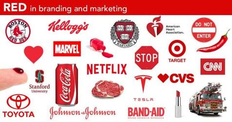
YouTube uses red in the play button of the logo which helps compel the user to action.

Blue Colour Psychology
The colour blue is associated with the sea and the sky. For the Egyptians, blue meant that it was close to the heavens of the gods. Many associate blue colours with stability, harmony, peace, calm and trust. As the saying goes, “feeling blue” can also mean feelings of sadness, depression.
These are important emotions for advertisers to consider when choosing blue for a colour scheme. Some retailers colour their trust certification or free shipping icons in blue because of the associations with trust.
Examples of the Colour Blue in Marketing
Facebook, Twitter and Skype are the iconic tech brands that often use blue in their marketing and logos. Banks also commonly choose blue for their colour scheme to help build trust in their brand.
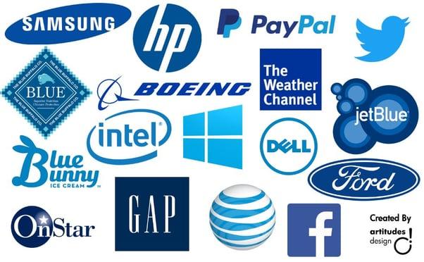
However, banks are moving away from this traditional colour palette and choosing colours that resonate more with a younger, more modern audience.
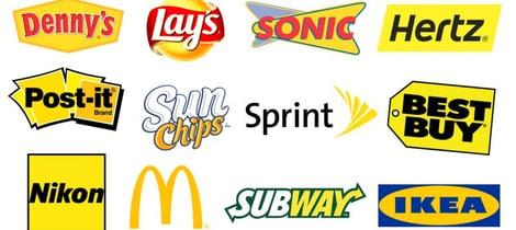
Yellow Colour Psychology
The colour yellow implies positivity and sunshine. It evokes feelings of happiness and optimism. Advertisers may choose to use a bright yellow as the background for their web page, the call-to-action buttons, content, or the logo because of its ability to stand out and its association with positivity.
Some advertisers choose to use a bright yellow colour as the background or border for their web page, to highlight content, or create a strong logo. It is also a compelling choice for call-to-action buttons as it stands out.
Examples of the Colour Yellow in Marketing
Brands like IKEA use the colour yellow to reflect the joy and optimism of designing your home. It creates a bold and instantly memorable logo and is used alongside other warm colours throughout the website design:
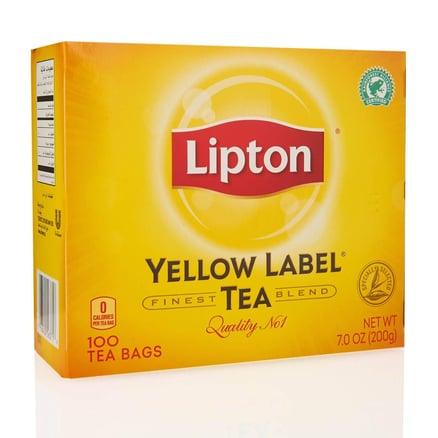
Lipton Tea also uses yellow as a brand colour and includes it in one of their product names, “Yellow Label”. The packaging design clearly represents the sun to evoke feelings of happiness and invigoration that occurs from its “sun ripened” tea leaves.
Secondary Colours
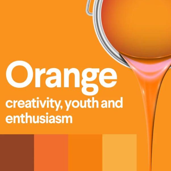
Orange Colour Psychology
Orange represents the colour of creativity, adventure, and enthusiasm. It's the result of red's energy and yellow's optimism. Importantly for advertisers, warm colours like orange can also represent physical comfort like warmth and can also help stimulate appetites making it great for food brands.
The colour orange can be used to add fun and freedom to any picture, website, or marketing material. It can also draw attention to a particular element of advertising, content or design, such as a call-to-action button or special offer.
Examples of the Colour Orange in Marketing
Orange's colour meaning shines through in logos like Dunkin'. As an accent colour, it is playful and creative while also appealing to appetites.
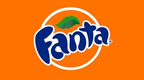
Fanta is another iconic brand that does not shy away from orange to represent energy and excitement. It uses the orange throughout its web content to great effect:
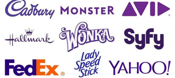
Purple Colour Psychology
In colour psychology, purple is the colour of royalty. The colour is connected to power, luxury, and spirituality. However, from an opposing point of view, this colour can cause feelings of frustration or arrogance.
Examples of the Colour Purple in Marketing
Purple is a colour used by chocolate brands, including Cadbury and Milka. No surprises when you consider they are selling an indulgent product.
Cadbury adds the accent colour of gold to work as a contrast to make it even more luxurious.
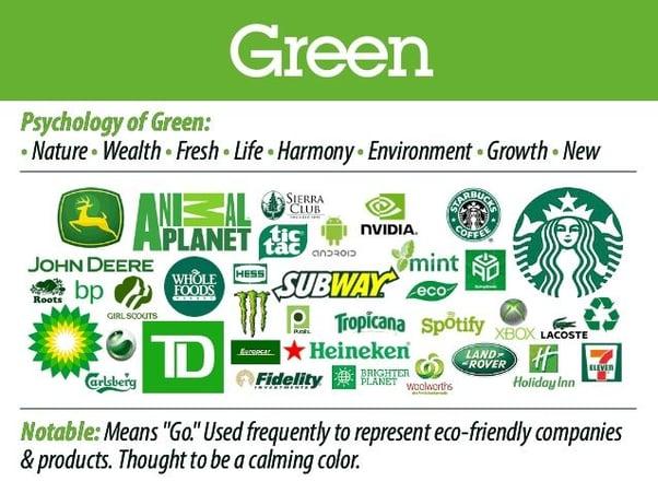
Green Colour Psychology
The third secondary colour is green. Its meaning is predominantly connected to nature and money while also representing growth, fertility, health, and generosity. There are also some negative associations with the colour green such as envy.
Green is a standard colour choice for those wanting to demonstrate a link between their sustainable brand message and nature.
Examples of the Colour Green in Marketing
The major supermarket Woolworths, located in Australia, uses green to help showcase its products as fresh. The colour goes with the slogan, “The Fresh Food People” and is spread across their website, branding, content and point of sale.
Other Colours
Pink Colour Psychology
It's no surprise that pink is a popular colour choice for brands who have a female target audience. Pink represents femininity, playfulness, innocence and love. Pink is also seen as a colour preference as an accent or contrast. For example, Uber's primary brand colours are black and green, but they use pink to accent their marketing materials.

Examples of the Colour Pink in Marketing
Victoria's Secret, a women's lingerie chain, has a sister company called Pink. Pink's target audience is young female women and represents femininity and innocence.
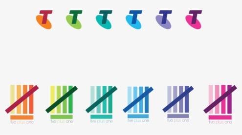
Telstra, the popular telecoms company, changed its colour palette to include a vibrant magenta to symbolise the diversity of its customers and services.10 It now uses pink in different areas of its content, depending on the product.
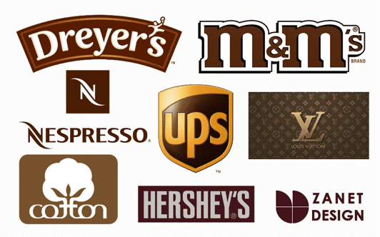
Brown Colour Psychology
Brown might not be the most exciting colour for brands, but it works great as an earthy, natural colour. Brown is typically found in marketing for natural products because it represents the colour of earth and wood.
Examples of the Colour Brown in Marketing
Iconic Australian brand R.M Williams uses a bold brown colour throughout its online content. It represents the heritage of the brand while also signalling its leather products.
Recap of Colour Meanings
- Red signifies excitement, youthfulness, and boldness.
- Yellow signifies optimism, clarity, and warmth.
- Blue signifies trust, dependability, and strength.
- Orange signifies friendly, cheerful, confidence.
- Purple signifies creativity, imagination, and wisdom.
- Pink signifies femininity and playfulness.
- Green signifies peace, growth, and health.
- Brown signifies nature, heritage and earthiness.
How to Use Color Psychology in Marketing
When harnessed properly, colour psychology plays a fundamental role in creating memorable brand identities that last for generations.
Think of iconic brands like Mcdonalds (yellow-red), Tiffany (turquoise blue), FedEx (violet-orange), and Apple (black-grey). Here are some tips for young brands seeking to use colour psychology for marketing:
1. Focus on the Desired Outcome
Successful brands always have a clear idea or image that they want to project to their target audience.
Taco Bell is a fast-food company that started out in the 1960s as the main source of Mexican-style cuisine in the US. The use of colours from the Mexican flag perfectly conveyed this message to consumers.22
Pharmaceutical companies - such as Pfizer - predominantly rely on blue shades because they resonate with ideas of safety, dependability, cleanliness, and knowledge.

Brands need to consider their core values and the ethos they want to project when picking their colour schemes.
2. Develop a Palette
Consistency is important, but that doesn’t mean restricting the brand to a single colour, which can create a perception of one-dimensionality. This is why most marketing professionals advocate a range of colours - a handpicked colour palette for every brand.
One popular option is to pick colours that starkly contrast - such as black-yellow or red-black for a more bold and memorable look. Other common strategies include picking different shades of the same colour (monochromatic) or picking colours that are adjacent on the colour wheel (analogous).
Microsoft has a striking colour palette made of four contrasting colours - red, blue, green, yellow, and grey. MasterCard, with its iconic red-orange spheres, is a great example of an analogous colour scheme. Pfizer has a colour palette made up predominantly of monochromatic shades of blue and navy.
3. Be Aware of Cultural Context
The meaning and symbolism behind colours can vary dramatically depending on cultures around the globe. They are broadly divided into Western, Far Eastern, Middle Eastern, African, and South Asian groups for the sake of simplicity.
However, there can be major differences between cultures in the same region regarding views on a particular colour. For example, while black is a colour associated with stability and prosperity in many Far Eastern cultures, it is considered the colour of mourning in Thailand.23
4. Check Out Rivals
This can work in two ways. If most rival brands follow a common palette, the safe option would be to follow the trend. The majority of pharma/healthcare companies use blue colour palettes - Pfizer, Roche, Amgen, Kaiser Permanente, and AbbVie.
However, a brand can also opt for a totally different colour to stand out from the crowd.24 J&J, Eli Lilly, and GSK are pharma brands that don't use the traditional blues, opting for bolder colours such as orange and red instead.
5. Be Consistent
Once the colour palette is finalised, it’s important to use it across all of the brand's promotional activities and content. All successful brands follow this rule religiously.
Coke ads are always splashed with an overwhelming tide of red (blue for Pepsi). Apple liberally uses grey, white, and black shades in all its branding, packaging, and promotional content without any deviations.
Final Thoughts
Countless studies have removed any doubt that colour theory impacts human behaviour. When it comes to marketing, colour is a powerful tool that can evoke feelings, convey the right message and influence purchasing decisions. It's also a great way to create a connection with customers and represent a brand's personality.
However, there is no golden rule when it comes to colour in marketing. Colour theory shows that everyone experiences colours differently, and what works for one target audience might not work for another.
The important thing is to pick colours based on brand personality and test different elements of the website to improve the overall CTR.
Become an Advertiser with Commission Factory
Commission Factory is not only the Asia-Pacific region’s largest affiliate platform, working with more than 800 of the world's biggest brands, but is also a performance marketing platform that allows content creators and influencers to earn money and online businesses to increase sales.
Commission Factory has a demonstrated track record of helping its brand partners reach new and existing audiences, build awareness, and scale their online sales. Connect with the Commission Factory team to learn more about how we help to build brand awareness and grow affiliate sales.
Colour Psychology in Marketing - FAQs
How Is Colour Psychology Used in Marketing?
Colour psychology is used in marketing to influence consumers and communicate certain values or emotions about a brand or product. Through the strategic and consistent use of colours in logos, packaging, and advertising, marketers try to create certain associations and trigger specific actions among the target audience.
What Are the 4 Psychological Colours?
The four psychological colours (besides the basic black and white) are the primary colours red, yellow, blue, and green. They are also called the chromatic colours. Red is associated with energy, excitement, and passion. Blue stands for trust, calmness, and reliability. Yellow is for cheerfulness, warmth, and optimism. Green symbolises nature, tranquillity, and growth.
References
- PANTONE® USA | How Do We See Color?
- In the blink of an eye | MIT News | Massachusetts Institute of Technology
- Impact of color on marketing | Request PDF
- BP Rebranding in 2000 - Marketing Campaign Fails #2
- Unlocking the Power of Black and Yellow in Branding | Simplified
- I paid $75 for the TikTok-viral personal color analysis in South Korea. The trained consultants told me I've been dressing all wrong.
- The Science of Color.
- THE LATE PERIOD OF ANCIENT EGYPT COLORS USED IN EGYPTIAN ART
- https://www.readebook.net/download-color-persuasion-the-science-of-using-color-to-persuade-and-influence-purchasing-decisions-dynamic-media-series-book-2-pdf/
- Which CTA Button Color Converts the Best?
- McDonald’s Green European Revolution – Into the Consumerverse
- An experimental study of gender and cultural differences in hue preference - PMC
- Color and the World’s Major Religions | Sherwin-Williams
- Why Color Palette Branding Matters | Pinckney Marketing
- How to choose your brand colors (plus 10 examples to learn from)
- Why is blue the world's favorite color? | YouGov
- Branding Color Ideas for Eco-conscious and Green Businesses
- What Is A Black Card? | Bankrate
- The history of the Pepsi logo - 99designs
- The Button Color A/B Test: Red Beats Green
- Website attributes in urging online impulse purchase: An empirical investigation on consumer perceptions - ScienceDirect
- Taco Bell Logo Design – History, Meaning and Evolution | Turbologo
- Interesting Facts about Thailand’s Colors – Inside Colors
- Pharma colors and marketing: Typically ‘awash in blue,’ newer brand updates adopt bold hues – Endpoints News